http://www.blogger.com/www.aiesecukm.org
Before it went online there were a few changes that took place.
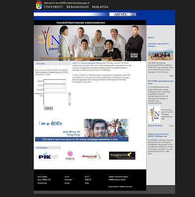
- The background color was changed from orange to black. The orange wasn't that attractive and I got alot of bad feedback on using orange as a background.I got to know there are alternative colors when it comes to branding, which is black and white.
- The website was center aligned. Being left aligned caused the web site to look unbalanced when viewed on wide screen and higher resolutions. Using tracking tools I discovered the website was mostly viewed on laptops.(guessing mostly students viewed it)
- A Major event called 'EYLN' (entrepreneurship youth learning network) by AIESEC UKM is coming and needs publicity. So the main flash was changed to something related to EYLN. It also linked to the online registration page of this workshop.
- A forum was created for the use of the clubs members as a collaberation and communication platform. The forum is a php bb forum.
I feel there are improvements that can be made or even a whole new facelift. However as a designer thats my nature. If the design proccess goes over 4 weeks, i get bored of the design, and get new ideas. So sadly I'll have to be firm and put down my foot here.
Here's some screen shot from my site tracking tool. It give a whole lot of information about the people who have been viewing the page.


The new web-page is impressive. The changes made- such as being centre aligned adds more attractiveness.
ReplyDeleteI would also like to point out the research has been done well. Like students visiting it more on their laptop , so it should be made user friendly to them in particular.
Vivek
AIESEC India